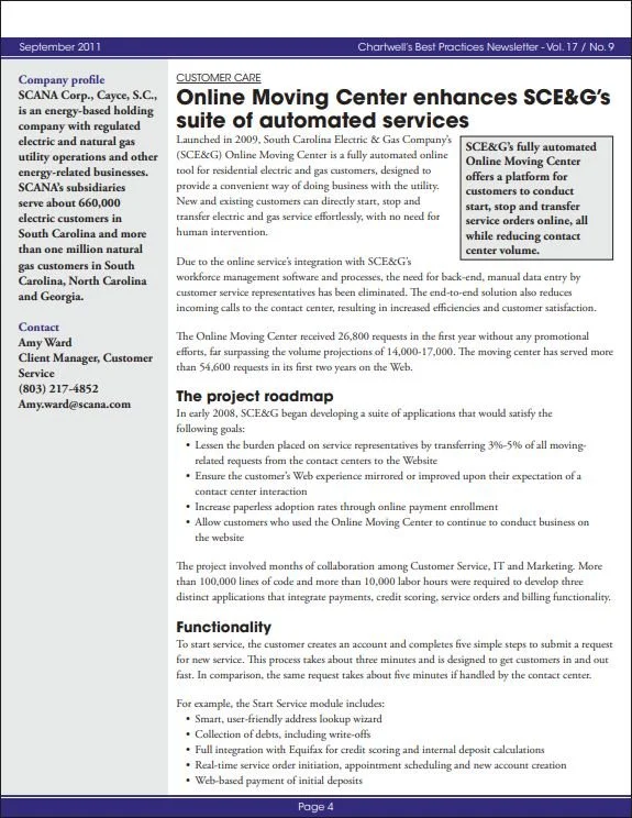
Moving is complicated enough without long phone calls and cumbersome utility forms. I led the UX redesign of SCE&G’s online Start, Stop, and Transfer service experience—simplifying customer workflows, reducing completion time, and enabling more service orders to be processed automatically.
The Opportunity
Moving is one of the highest-friction customer journeys for a utility. Customers need to start service at a new address, stop service at their previous home, or transfer service between locations—often while managing dozens of other moving-related tasks.
At SCE&G, these requests traditionally involved lengthy phone calls, manual data entry, and processes shaped by decades of call-center scripts. The initial online experience carried that same complexity into a digital channel, contributing to abandonment and low conversion.
The opportunity was to rethink the process from the customer’s perspective and make routine service changes fast, intuitive, and fully automated.
Redesigning for Simplicity and Speed
As Lead User Experience Designer, I led the design, testing, and refinement of the Start, Stop, and Transfer experience.
Rather than simply moving the existing questions onto a web form, I challenged the assumptions behind the original process. We focused on what information was actually needed, when it was needed, and how to help customers move through the experience without unnecessary effort.
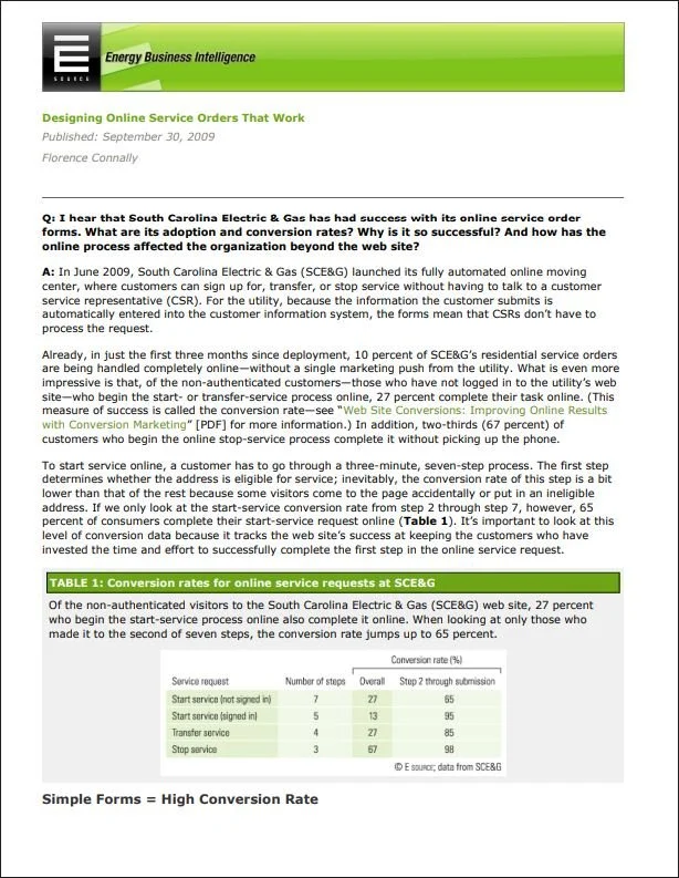
The redesign reduced the Start Service flow from 15 minutes to just 3 minutes. Transfer and Stop Service were also simplified into four-step and three-step processes, respectively.
The result was a more focused experience that respected customers’ time while supporting the operational requirements behind each service order.
Solving the Address-Matching Problem
One of the biggest barriers to automation was inconsistent address data in the customer information system.
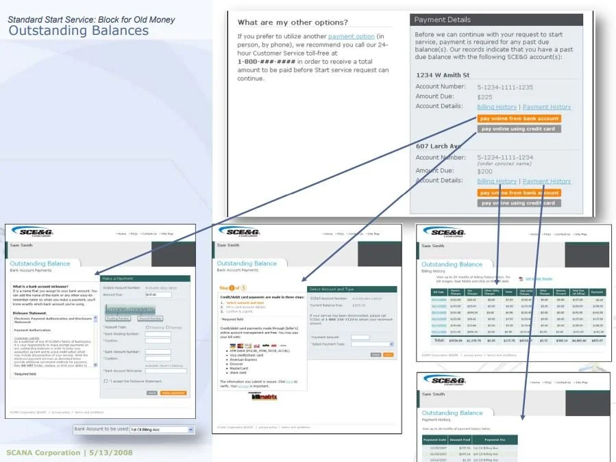
When customers entered addresses that didn't match existing records, the resulting errors could interrupt the process and create downstream work for employees.
I redesigned the address-entry workflow to begin with the ZIP code and street number. The interface then dynamically generated matching street names, helping customers select a valid address rather than relying on free-form entry alone.
This addressed a critical point of friction at the source: better input produced more reliable service orders, improving data quality and reducing errors that could otherwise lead to unnecessary field service calls.

Designing for Different Customer Needs
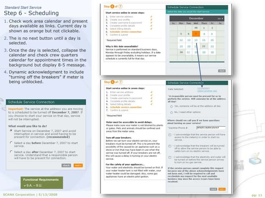
Usability testing revealed two distinct behaviors. Some customers wanted to complete the process as quickly as possible; others wanted additional guidance and reassurance along the way.
The design needed to accommodate both without compromising either experience.
I created a layout that let confident users move rapidly through the form while making optional guidance available to customers who needed it. Help was accessible without forcing every customer through additional instructions.
This approach balanced efficiency with reassurance, recognizing that a good customer experience doesn't require every user to follow the same path at the same pace.
Validating Before Development
Because these workflows affected a large volume of customer transactions, usability needed to be established before development.
We conducted extensive internal and external usability testing, using feedback to refine the interaction design and confirm that the experience aligned with real customer behavior.
This iterative process helped identify friction before implementation and ensured that the final design supported both customer needs and the operational requirements of the business.
The Results
The redesigned Online Moving Center delivered measurable improvements in adoption, conversion, and operational efficiency.
Faster completion: Start Service time dropped from 15 minutes to 3 minutes.
Strong online adoption: 10% of all residential service orders were completed online within the first three months.
First-year demand: The experience handled 26,800 requests in its first year, far exceeding projections.
High conversion: Start Service reached 65%, Transfer reached 85%, and Stop Service reached 98%.
Fewer wasted field calls: Improved address accuracy contributed to an 80% reduction in wasted field service calls.
Operational efficiency: The redesign reduced call-center volume and shortened handle times.
The work was also recognized by Chartwell and E Source as a best practice.
The Impact
This project demonstrated how thoughtful UX design can improve both sides of a customer interaction: making an essential task easier for customers while reducing avoidable work for the organization.
By simplifying workflows, addressing data quality at the point of entry, and designing for different levels of user confidence, I helped turn a cumbersome utility process into a scalable digital service.
The broader lesson is that meaningful digital transformation comes from rethinking the process—not merely digitizing the steps that already exist.